On Saturday Julia and I visited the Tate to see works by William Blake and then went up the street to Westminster to see Eric Gill’s Stations of the Cross.
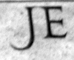
While examining them I noticed the variations in the type. In particular the J which, not surprisingly, features prominently in each of them.
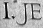
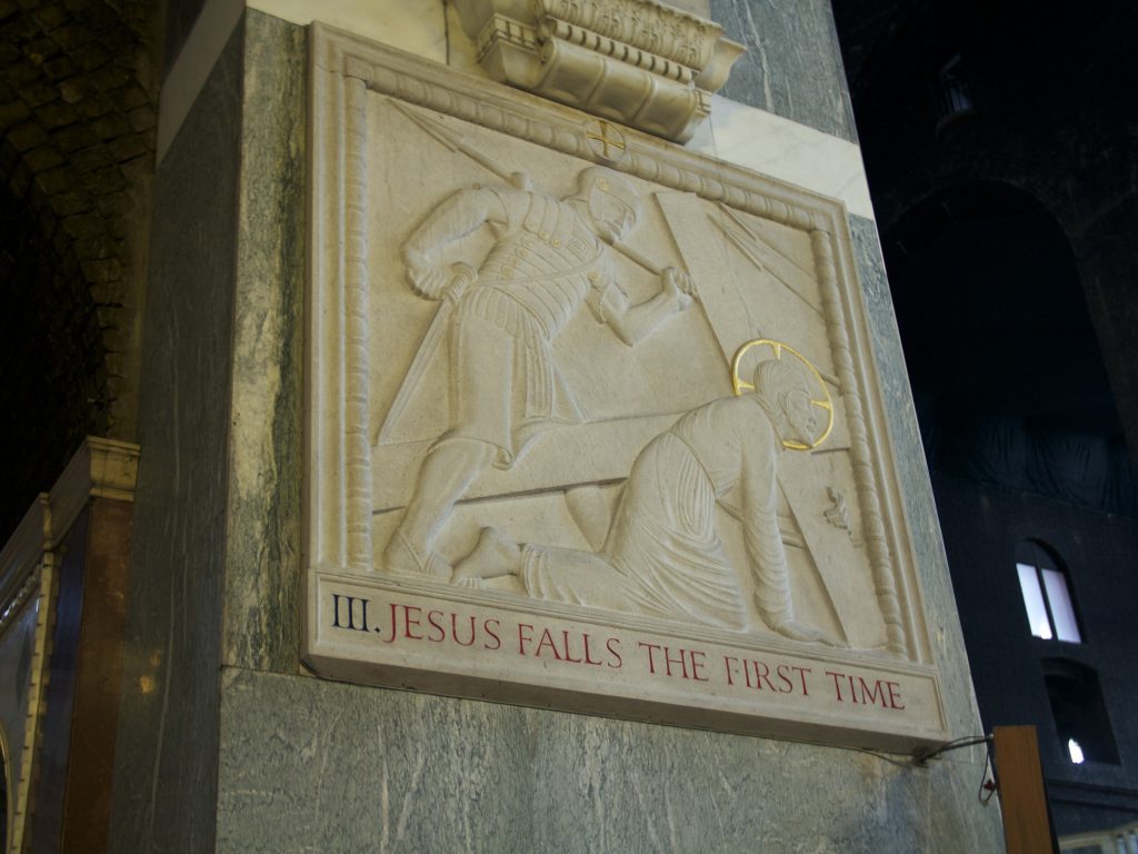
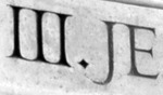
Each is different, being carved into stone individually. Here are some thoughts on the first 12 Stations of the Cross by Eric Gill. My photos suffer from my not having a tripod and the dim churchly lighting. Apologies for that.
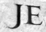
In the first, the J descends below the baseline to curve gracefully up to point towards the preceding period.

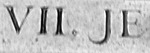
In the second station, the J does not descend below the baseline. This is the only instance like this. In addition, the letterspacing is very wide between the J and the following E.
The hook of the J is shorter in the third than in the first. But follows the same design of arcing into the preceding period.
Four’s J features a broadly curved J with more space between the numerals and the descriptive text.
A thicker overall letter begins to take shape at station five. A somewhat bolder appearance in contrast to the delicate lettering on the first four stations.

The short descending stroke in station six almost has a shoulder to it. Also, the graceful curves of the E can be made out a little bit in this image. The distance between the roman numerals and the lettering in this station is also the widest, with the numerals on the far left and the lettering centered.
The spacing of station seven is like that of station four but the curve of the J is tight, not directing towards the preceding period.
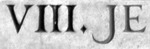
The J in station eight is somewhere between the elongated arc of four and the short arc of seven. Plus it has the thickened stroke.
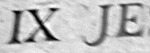
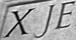
Once we get into the roman numerals containing X the period is dropped. In Station Nine, the arc of the J is slightly open, not curling through so far as the others.
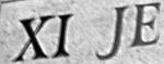
Station ten returns to a thin and graceful line with a tightened spacing, but not quite the JE ligature of station one and other tightened settings.
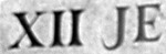
The JE of station eleven is in the heavier weight once again.
Station twelve features a J that curves back to penetrate the baseline on it’s upward ascent.
All of these Js, though different, are clearly of the same hand. They show the great variety that is available for a typeface while still maintaining a recognizable design.
Carving the letters into stone each time–as opposed to creating a punch or casting type for reproducing that letter many times–creates these variabilities. The stone may be different. The text and available space may be different. The demands of the client may be different.
But ultimately the letters hold together in something we experience as uniform and intentioned.